

Using Adobe Illustrator, Photoshop and Procreate to create 3 data visualizations that help users better understand the leading causes of death in children ages 1-14 in 2022. Each chart represents a different statistic while all relating back to one another. These visuals are to be used as posters and infographics for learning purposes.
Looking at large statistics data and excel charts can be challenging and dreadful. It can take away from the overall understanding of the data. Traditional graphs and charts displayed on posters and infographics are not engaging to viewers and are often overlooked.
4 weeks
Data Analyst
Visual Designer
Design Sprint
Tableau
Illustrator
Photoshop
Procreate
How might we create something for users to view the leading cause of death 2022 data in a fun and visually engaging way that summarizes its content in 3 simple visual graphics.
3 data visualizations highlight the main findings of Statistics Canada's 2022 Leading Cause of Death for children ages 1-14 data in a engaging and creative way that connects all findings together.
Choosing the right dataset was important, but dividing the data is crucial. When exporting the dataset, it was divided into 3 different sets of data to make it easier to condense and clean when creating graphs and visualizations later on.


Condensing and cleaning this dataset highlighted the more important information that was used to showcase the main insights of the data. For the final visualization, the top 2 leading causes of death in girls ages 1 - 14 was needed. To do so, filters were used in excel to showcase the highest number of deaths each year and their causes.
Before cleaning, the dataset was big and full of distracting numbers that was making it very difficult to pull insights and findings.

After cleaning, the dataset is easy to read. With the top 5 leading causes of death for each year laid out, ready to be visualized in a more creative way.

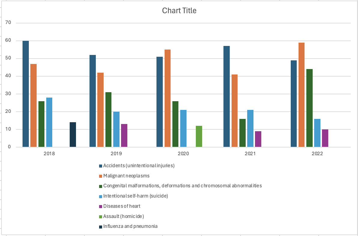
Before designing, it was helpful to put the data into a supporting graph to better visualize the information. The supporting graph allows for an in depth analysis and ensures the right information is being represented in the visualization.

By repeating the steps of cleaning and graphing the data, different focal points and insights were pulled for an accurate representation of the dataset as well as a variety of experimentation to ensure all viewpoints were covered before designing.


Similar to the previous leading cause of death for girls dataset, it was important to condense and clean the data to highlight the important insights. For the final visualization, the top 5 leading causes of death in boys ages 1 - 14 was needed. To do so, filters were again used in excel to showcase the highest number of deaths each year and their causes.
Before cleaning, the dataset was quite large and overwhelming to look at. It can be difficult to find any conclusions form this.

After cleaning, the dataset is easy to read. With the top 5 leading causes of death for each year laid out, ready to be visualized.

Before designing, it's helpful to put the data into a supporting graph to better visualize the information. The supporting graph allows for an in depth analysis and ensures the right information is being represented in the visualization.

By repeating the steps of cleaning and graphing the data, different focal points and insights were pulled for an accurate representation of the dataset as well as a variety of experimentation to ensure all viewpoints were covered before designing. The pie chart created was also used as inspiration for the final design.


For the final dataset, the same process was conducted in the cleaning stage of the process. For the final visualization, the number of internal vs external leading causes of death in children ages 1 - 14 was needed. To do so, filters were again used in excel to showcase the highest number of deaths each year and their causes.
Before cleaning, the dataset was quite large filled with data that was not important to the main insights.

After cleaning, the dataset shortened and an extra column was added to decipher which deaths were internal and which were external. This data was then used in the final data visualization for internal vs external deaths for children ages 1 - 14.

